The manga grand prize top drawing making complete version in March 2020, which clearly understands the points of retaking that makes the illustration more attractive
The production flow of 'Manga Grand Prize Top Illustration', which is only roughly published in the
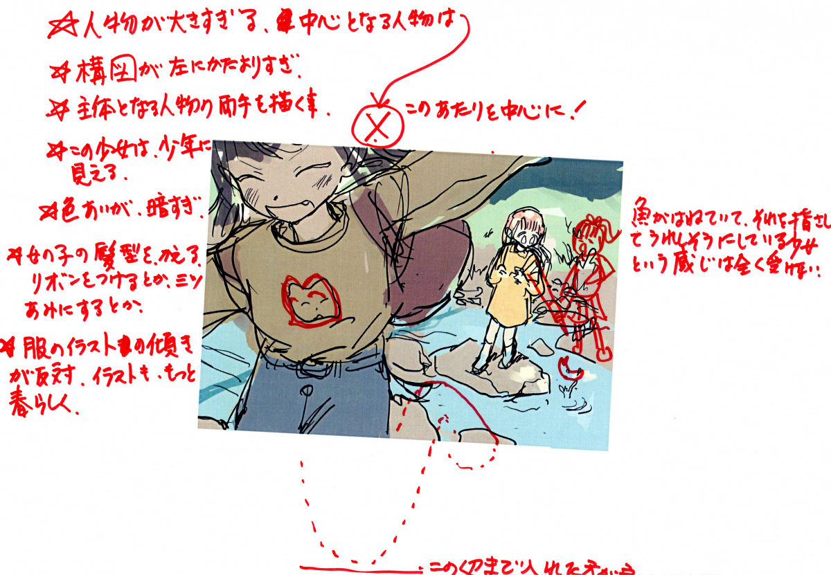
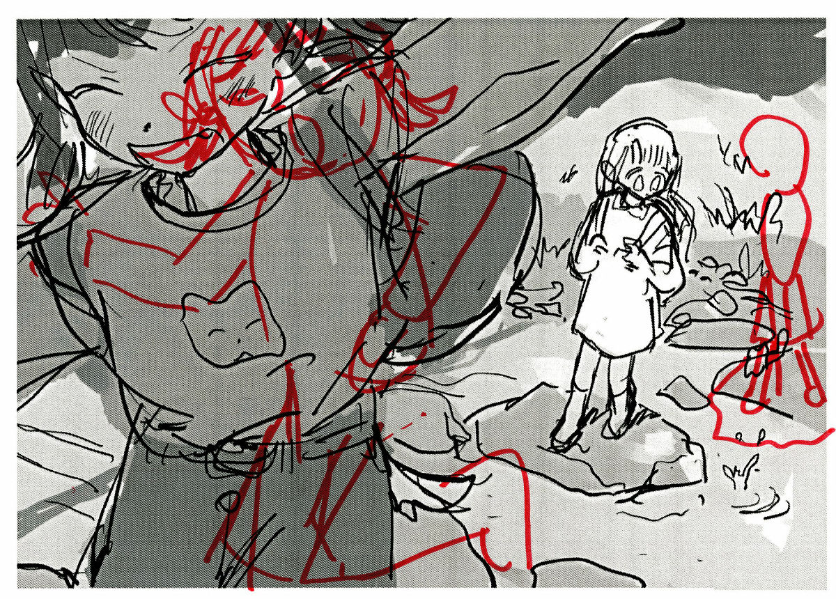
The first draft out of two drafts. It is one piece that feels the refreshing warmth that crosses the river in nature like a stone.
The second draft is a sad impression that makes you feel the farewell season, trying to get the petals falling from the train window.
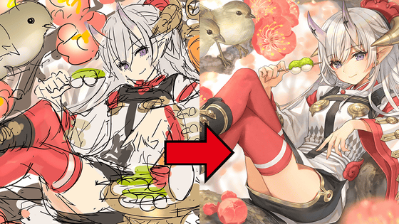
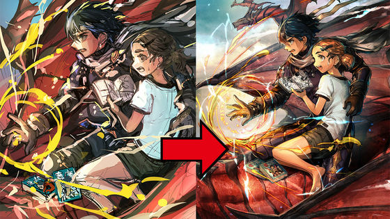
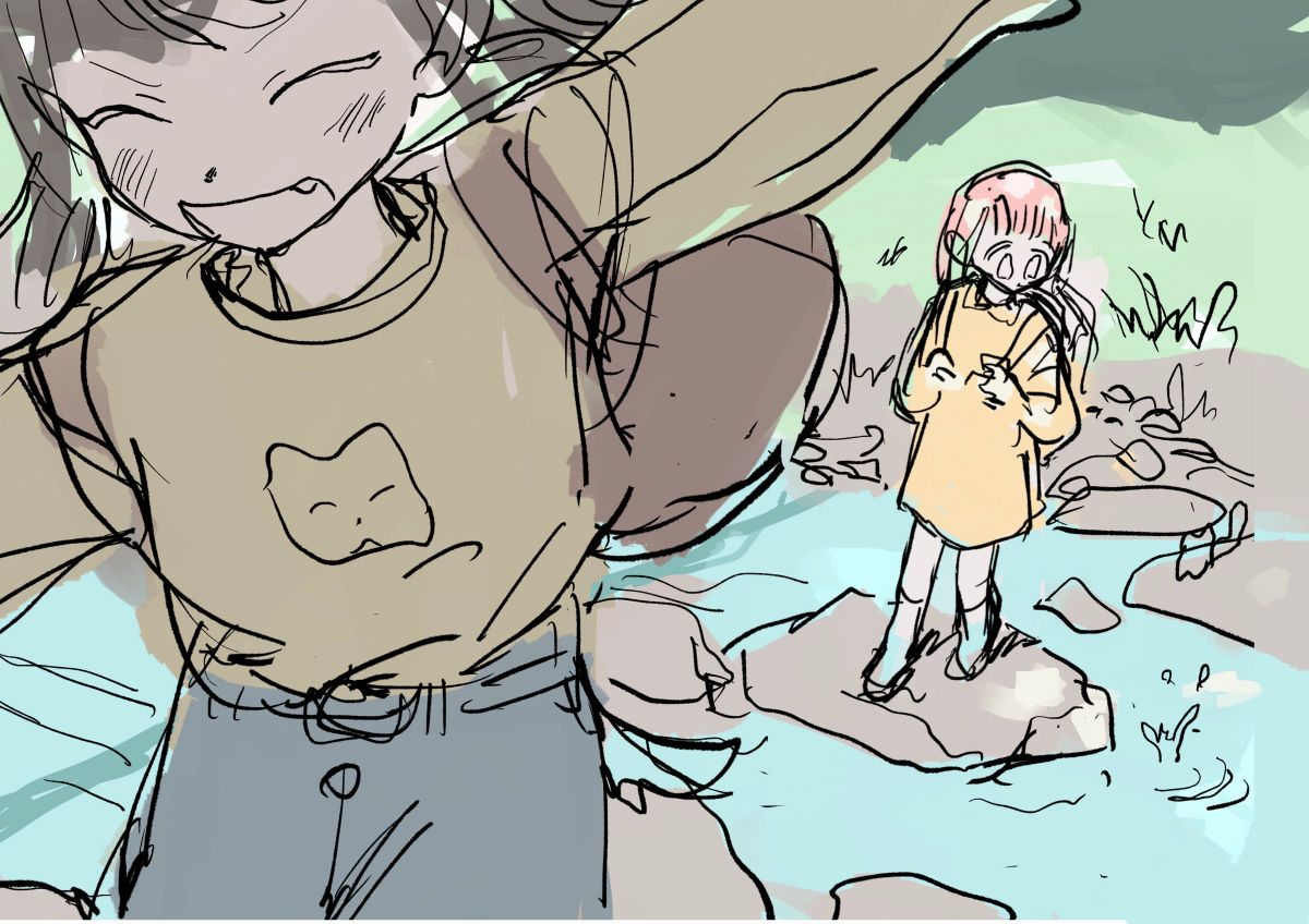
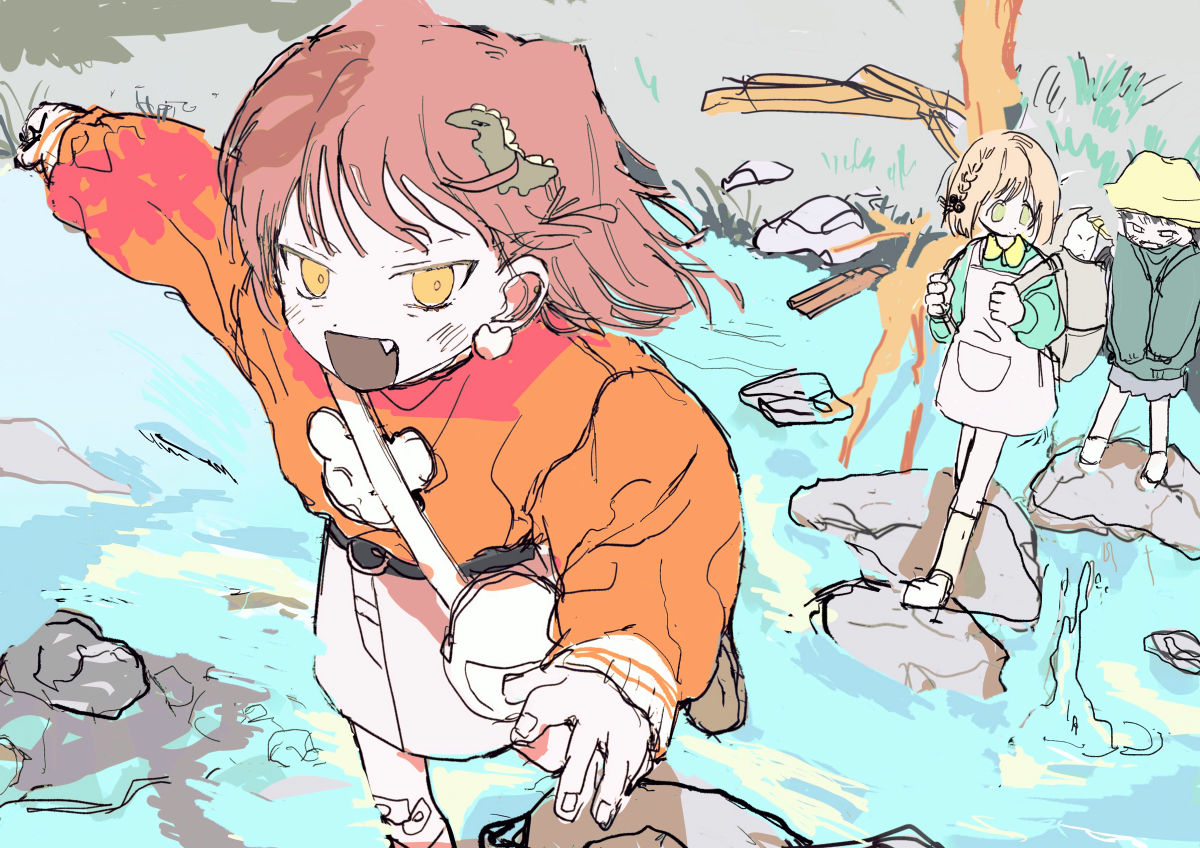
The first draft was adopted because a brighter impression would appear in the “top image”. When creating a more detailed rough from a large rough, emphasize the brightness because the overall color is darker than the theme of the illustration, and emphasize the vibrant feeling that the character is bouncing because it is attractive Since the relationship between the character in front and the character in the back is difficult to see, we asked for a retake to add a third person and strengthen the sense of group.
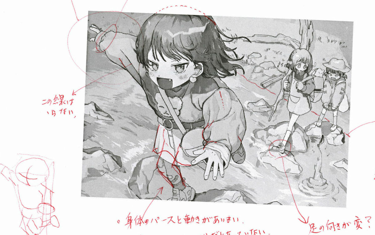
Also, it is interesting to see that the character in front is up, but if it is too close to the edge of the screen, the entire composition looks distorted, so while moving a little more to the center, pull the camera a little so that it jumps into the toe that jumps Also added things.
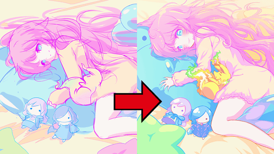
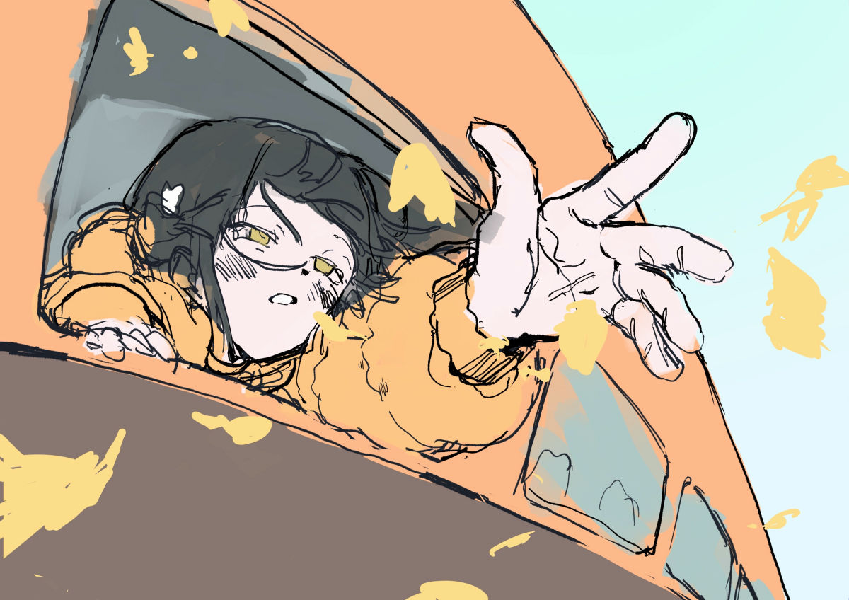
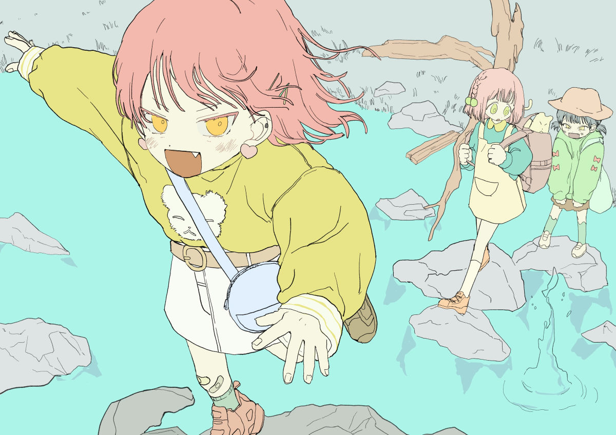
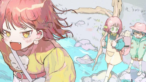
Detail rough reflecting the correction. The character has been significantly changed to increase the impression of brightness and to make the girliness easier to understand.
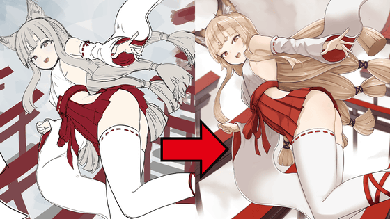
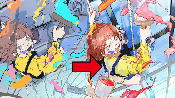
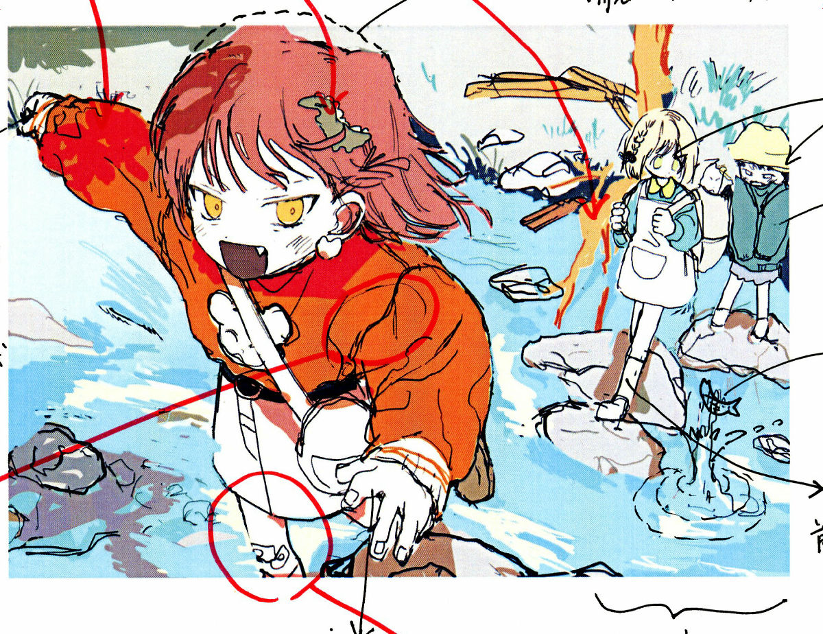
As the features of the top picture, it is assumed that it cannot be seen on a very large screen, so we avoid as much as possible a fun composition packed with elements and elements that are difficult to understand unless you look closely. In this rough, we cut the hairpin, which is likely to be distracting because it comes to the foreground, and the shadow of a tree assuming a stage in the woods, because the one without it gives the overall impression. Also, in order to further increase the dynamism of jumping, a modification has been made so that the right foot that lands on the stepping stone is within the frame even a little. This has to do with the perspective that if you don't draw a foot that has a center of gravity, you will give an unstable impression.
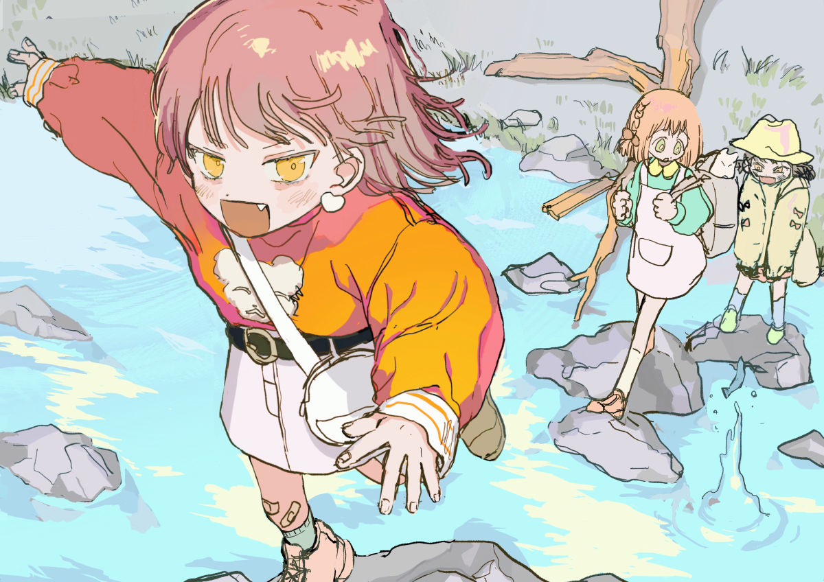
Final detail rough.
Line art and undercoat.
A finished illustration that has been painted and processed.
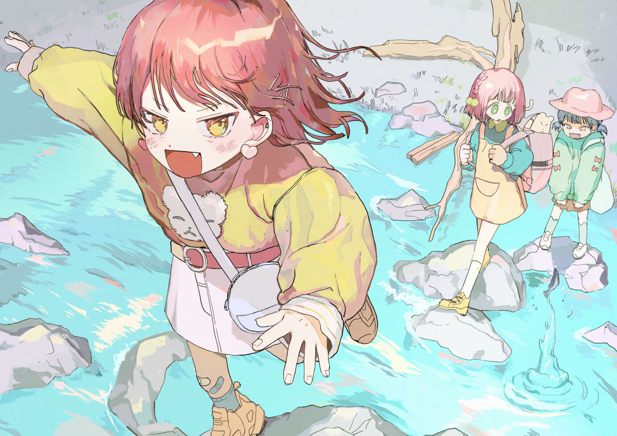
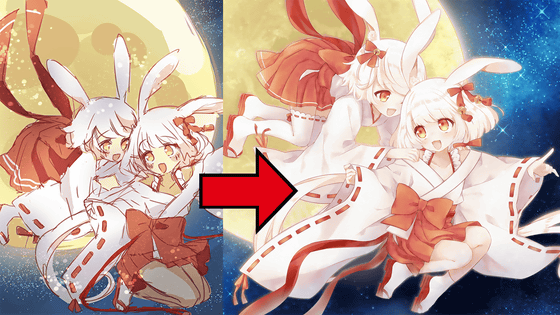
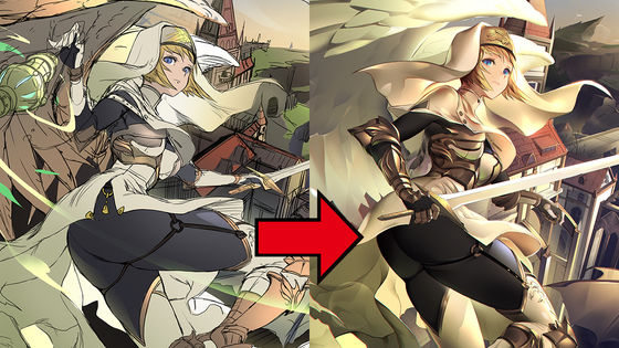
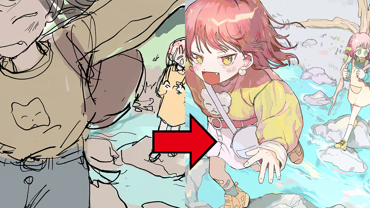
Finally, we asked him to retake his pose by reconfirming the pose of the line of the arm under the oversized jacket and the leg hidden by the skirt. Also, the theme of the illustration is that it will be a very tight illustration if the width of the river is clear, so while bringing the helicopter of the river hidden in the character to the front, the expression of the rock and the perspective of perspective Adjust the feeling.
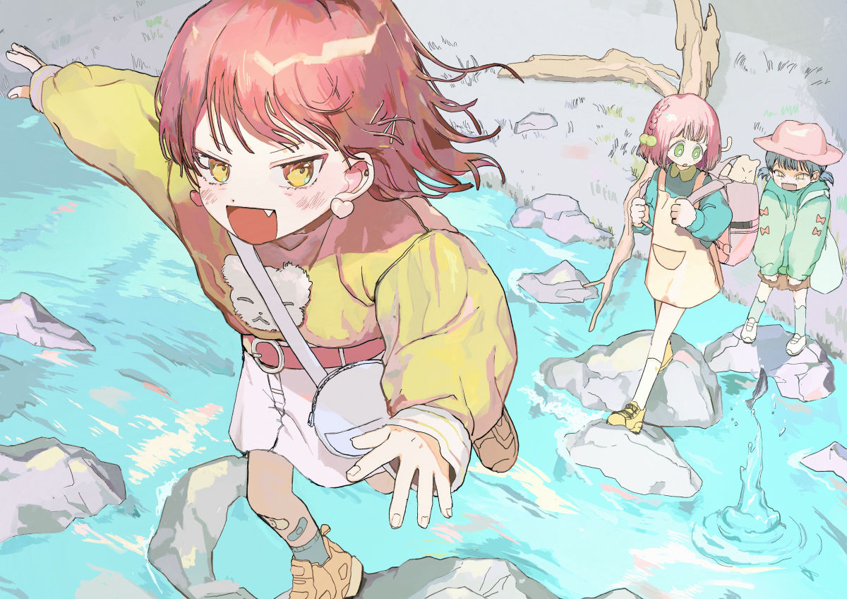
Final completed illustration.
The left is before correction and the right is after correction. You can see that the impression of the river has changed significantly.
Of the author Torinome 's with comments making it can be seen from below.
`` GIGAZINE Manga Award '' with renewed prize money and serialization conditions started recruiting in March 2020 & Top drawing making looks like this-GIGAZINE
In the future, in addition to making detailed illustrations, we plan to release treasured materials such as manga productions to members of GIGAZINE Secret Club, so there are requests such as 'I want to see such information!' 'I want to know such things!' Please come back soon.
Related Posts: