You can easily understand the `` impression of illustration '' received from the pose and composition, the January 2020 Manga Awards top drawing making complete version
The production flow of the 'Manga Grand Prize Top Illustration', which is only roughly
The first big rough. They were shown in black-and-white rough with a description of the theme and character so that there would be no problem even if there was a big correction.
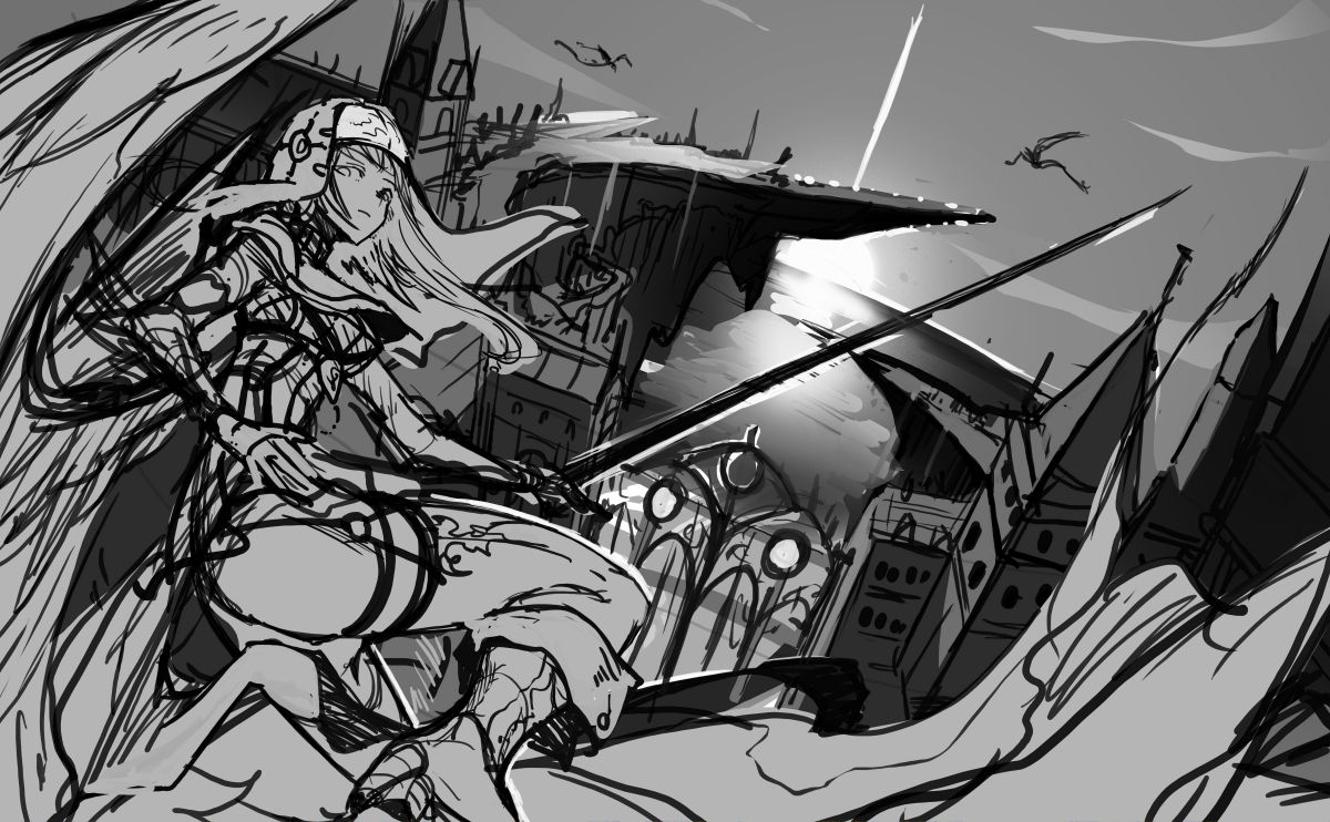
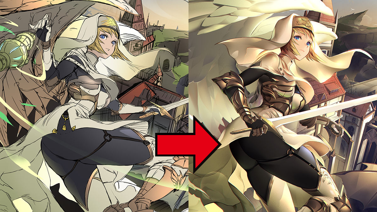
As a correction of the rough, first of all, while the composition with a beautiful background is attractive, the impression of the person is weak, so move it a little closer to the center, and at the same time adjust the lighting so that the character does not collapse due to backlight because it is a strong illustration Did. When the character is in the shadow position, the perspective seems to be lost, so it is necessary to give the person contrast that is not inferior to the intensity of the background light.
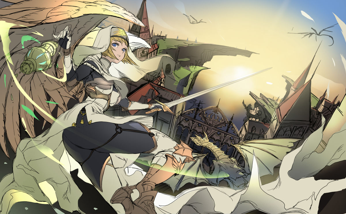
Color rough reflecting the correction. In the large rough, the right hand coming in front was empty and I felt sorrowful, but it turned into an interesting impression by raising the lantern, and by arranging the light source also in front I was devised to be aware of contrast. Is.
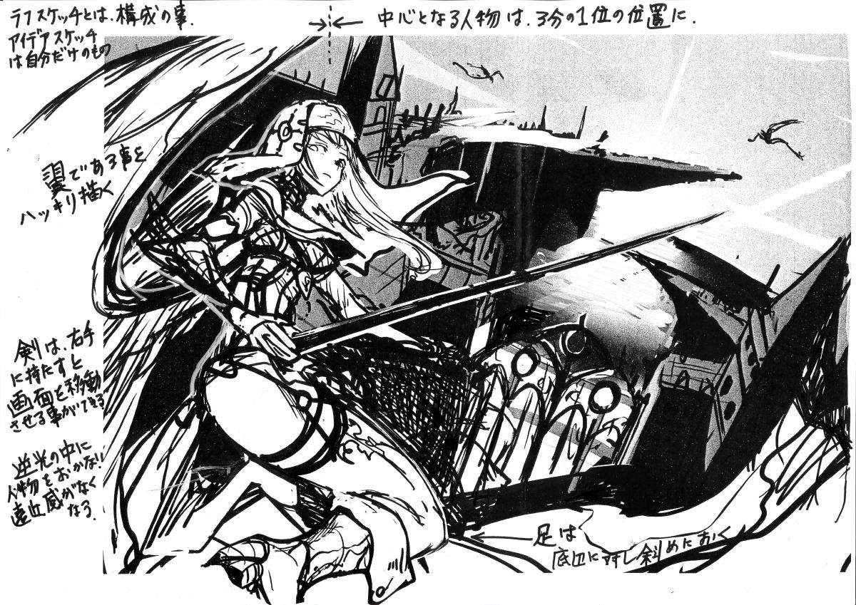
In the second modification, we asked the character to be as close to the left as possible and the specific gravity was still biased, and to move it as close to the center as possible. The thigh line is also conscious of the feeling that 'compositions parallel to the vertical line on the screen look monotonous and conspicuous.' Also, in order to make the impression of holding a long sword with one hand look more powerful, it has been changed so that it can be regained with the right hand in front and feel more powerful. The final rough after reflection is as follows.
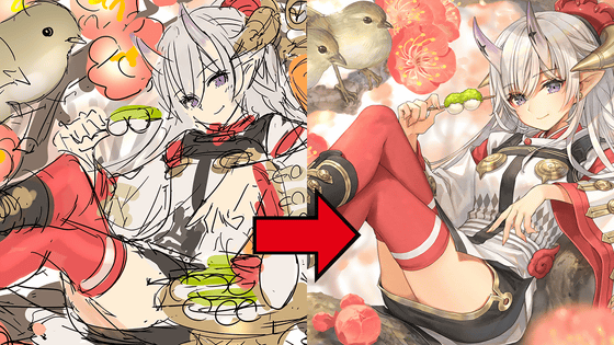
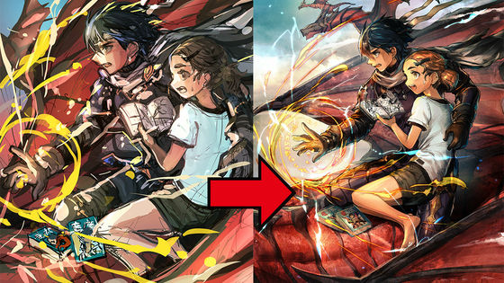
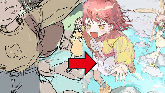
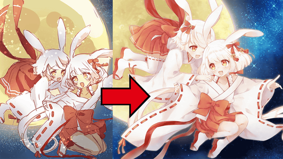
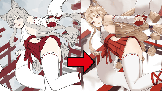
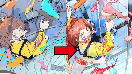
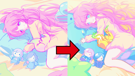
The left is before correction and the right is after correction.
Line drawing process.
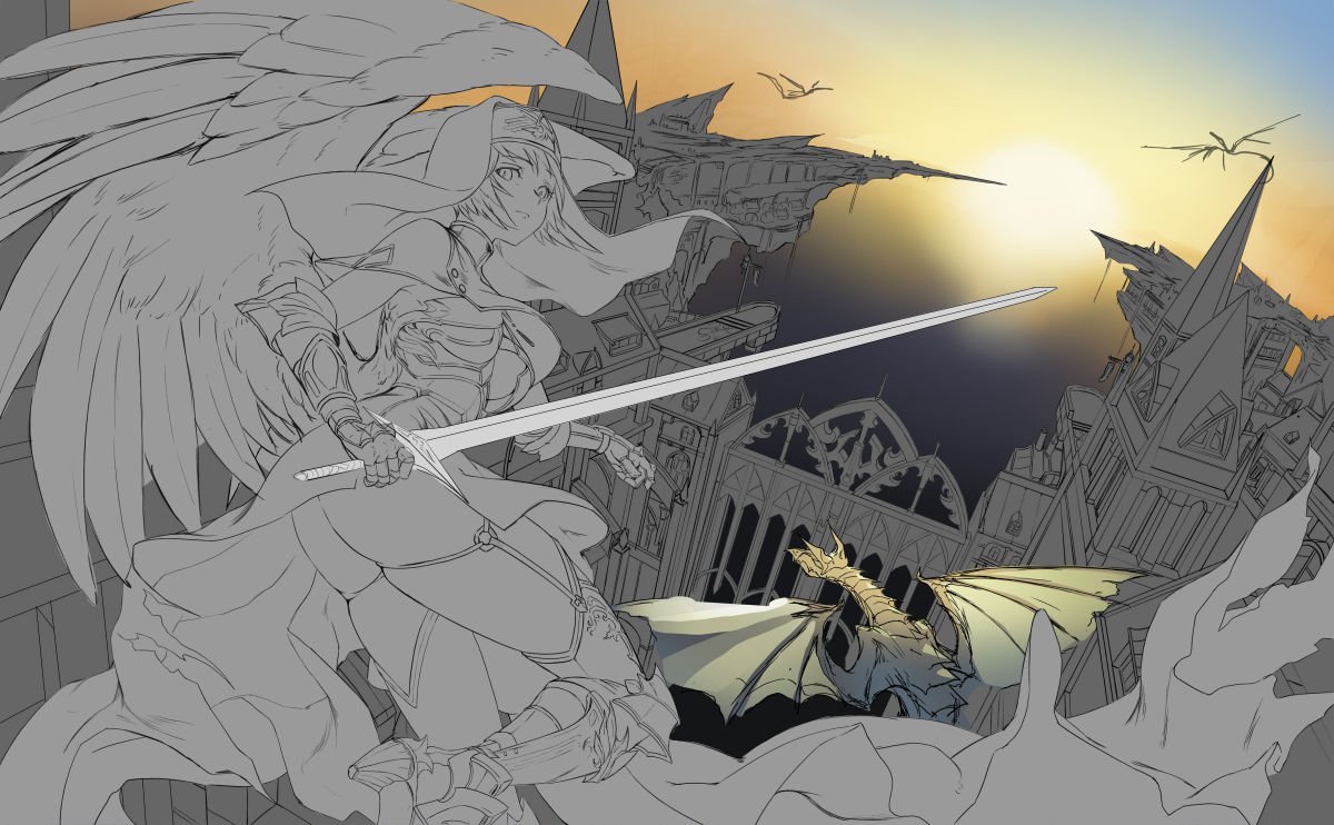
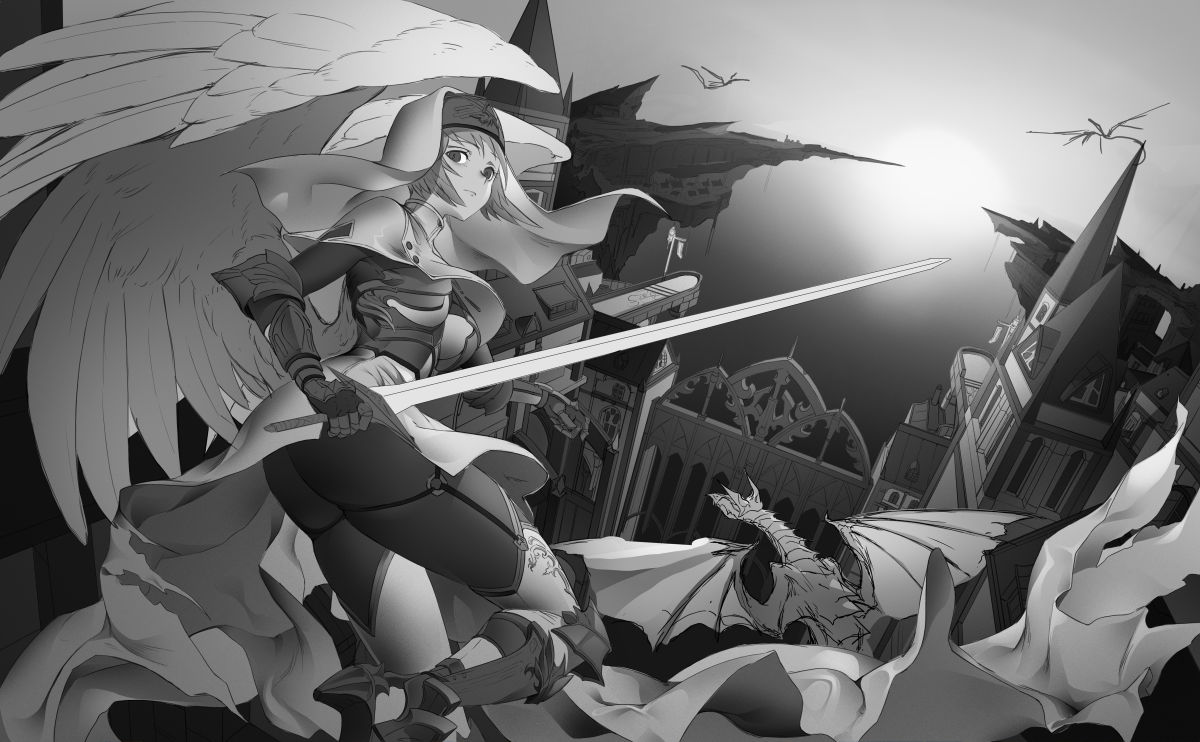
Before coloring, the shading adjustment is done in monotone.
Coloring process.
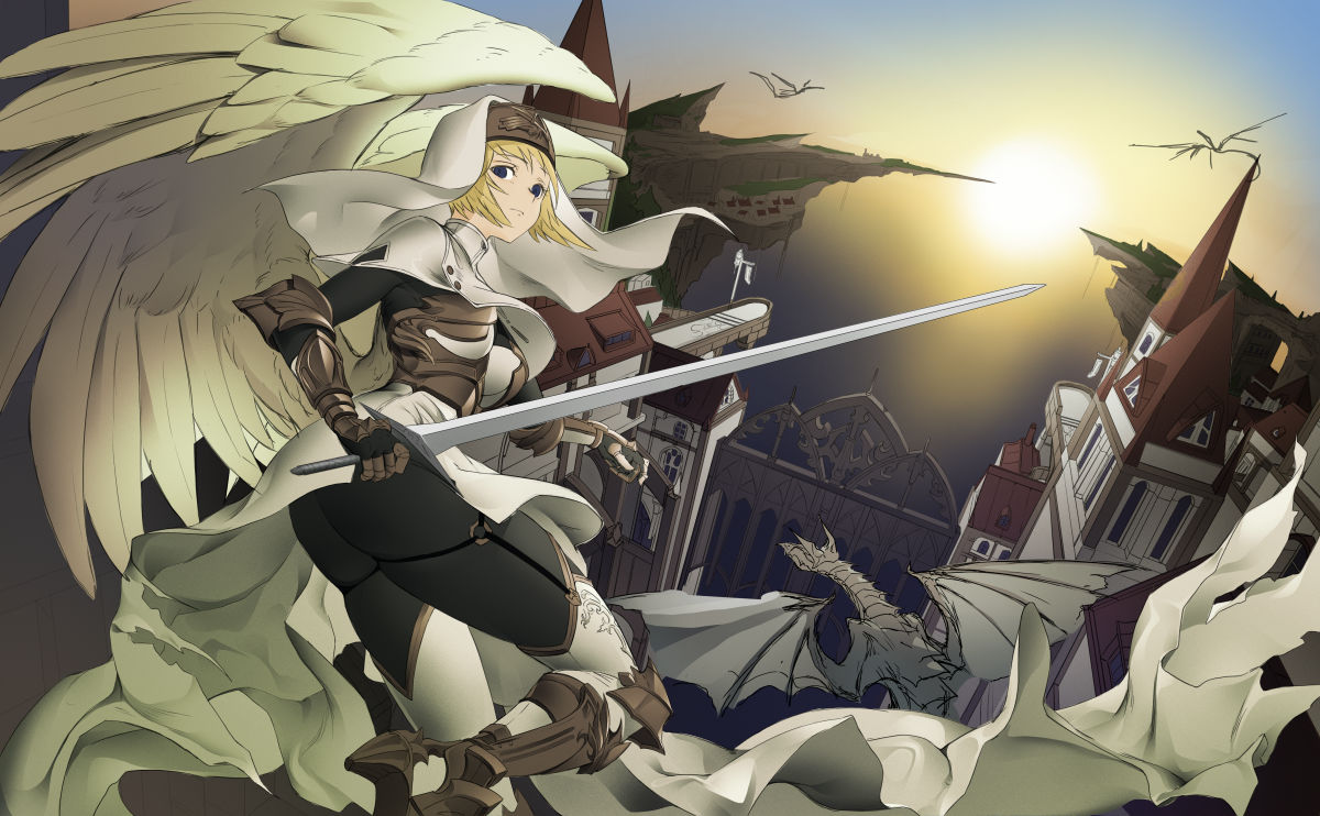
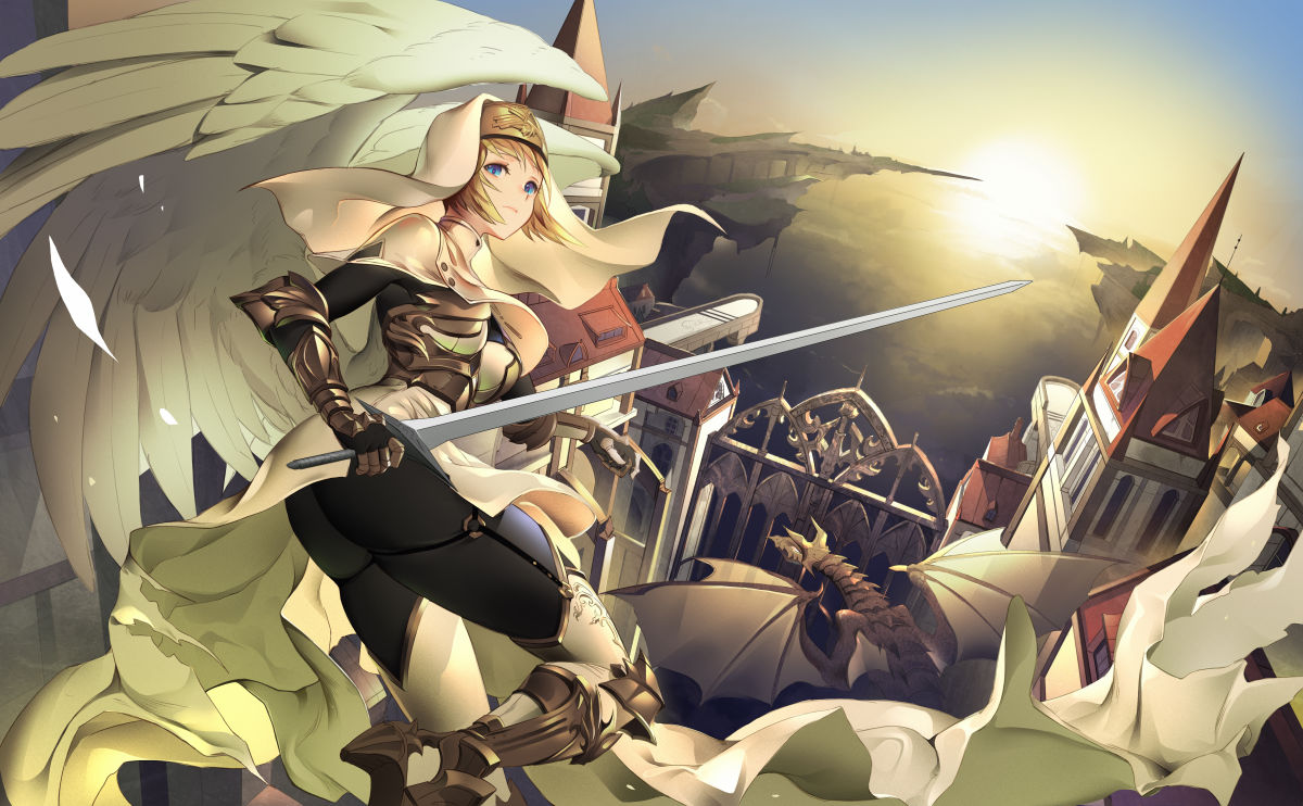
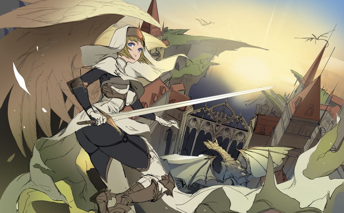
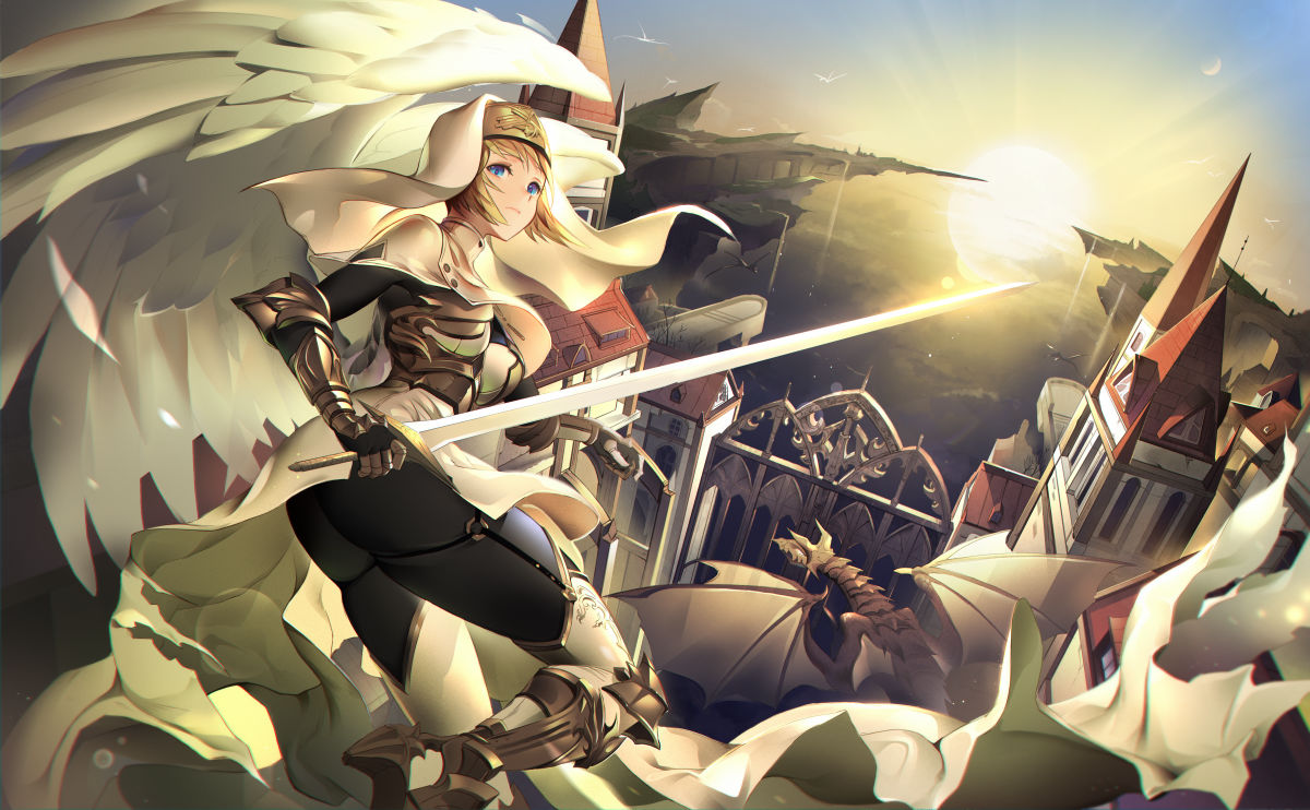
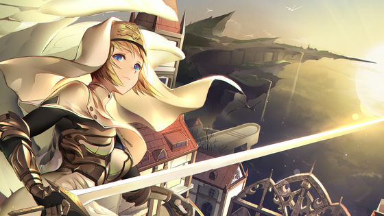
The completed illustration that was performed until the finish. Lastly, fine-tune that you want the background light to be too dazzling, so that it does not impair the overall theme, and that the character's face is sharp and bright and feels a bit floating. Did.
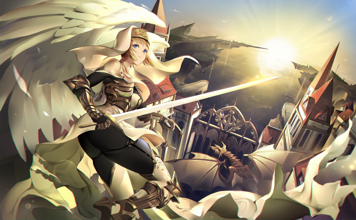
Final completed illustration.
The left is before correction and the right is after correction. Although it is a slight difference, you can clearly see that the impression at first glance has changed.
You can see the making of the comment by the author, Jizero, from below.
`` GIGAZINE Manga Award '' Started recruiting in January 2020 & Top drawing making looks like this-GIGAZINE
In the future, in addition to making detailed illustrations, we plan to release treasured materials such as manga productions to members of GIGAZINE Secret Club, so there are requests such as 'I want to see such information!' 'I want to know such things!' Please come back soon.
Related Posts: