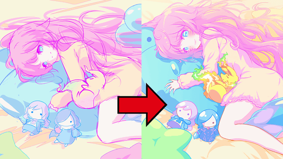
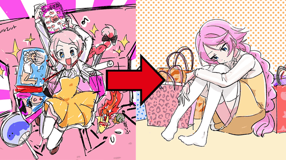
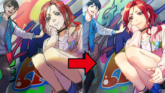
What did you do to make the illustration correction instructions as specific as possible and to increase the degree of completion? Making full version until August 2019 manga award top painting
Join GSC and enjoy GIGAZINE Manga more!
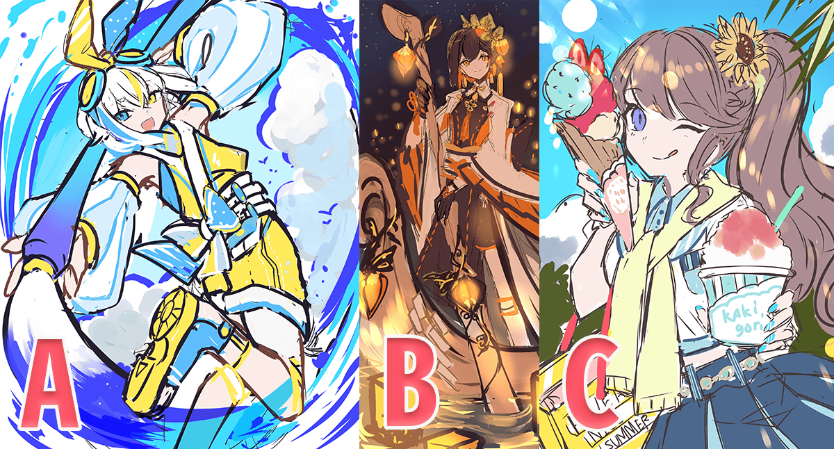
First of all, it is here that you have made 3 draft drafts. All expressed 'Summer' in August and they were attractive, but in the end, they adopted the girl and theme of 'C draft, but the pose, composition and background had a good sense of activity A. It was decided to proceed in the form of
The following rough reflects the above request. It was said that 'If it's fun to spread the items in the summer,' it makes you feel very well.
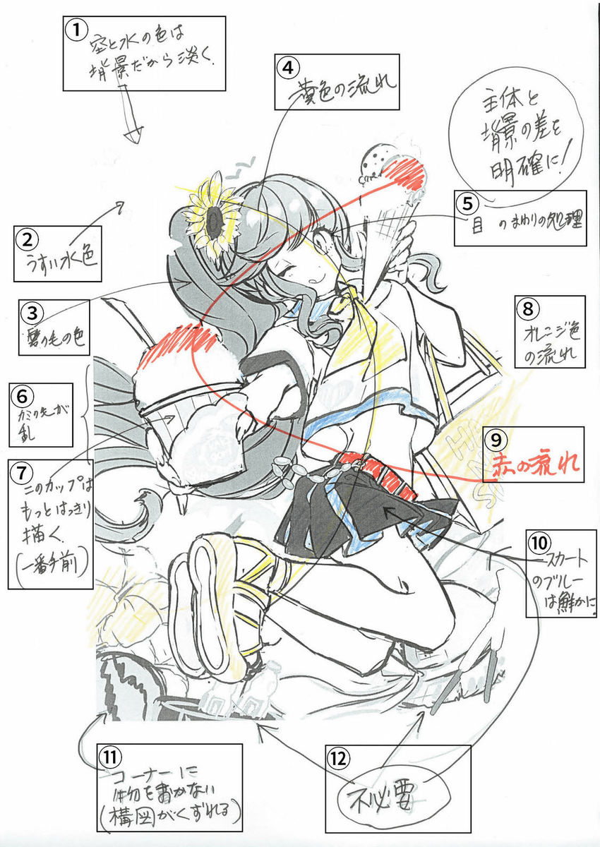
The first correction instruction mainly shows color expression. In particular, 'To distinguish the subject from the background and other small items, the subject is to increase the saturation to make it brighter and the background to be less saturated to make it softer' 'the curve painted in red, the curve painted in yellow, etc. The part of making the flow of color without putting the color apart is clearly understood as important as the illustration technique.
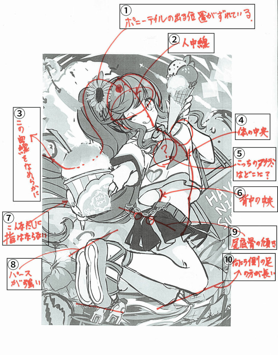
The second correction instruction mainly points out the accuracy of the body drawing method. Even anime / manga-like characters are not good things to break out of realistic shapes, but rather because they are illustration characters, it is important to bring as realistic a part as possible that gives rise to physical discomfort. thing.
Here is the rough version 3 that reflects the above correction. From the first image, it can be seen that the color composition that the trajectory correction is difficult, and the redrawing of the physical drawing that requires a lot of adjustment, reflects the tenaciousness with considerable excitement.
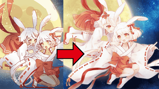
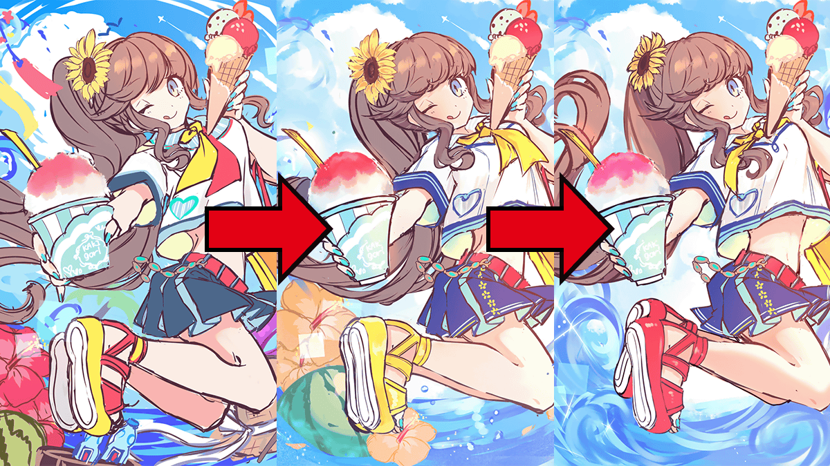
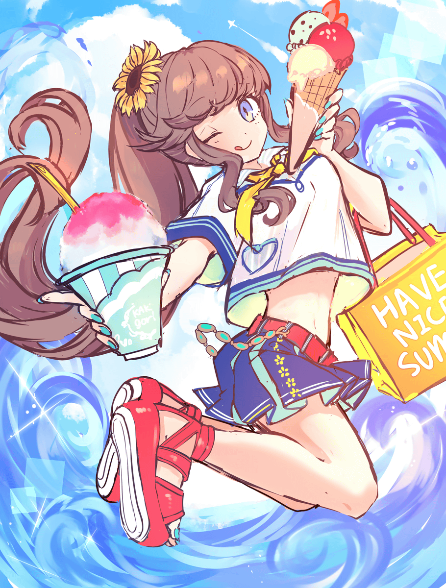
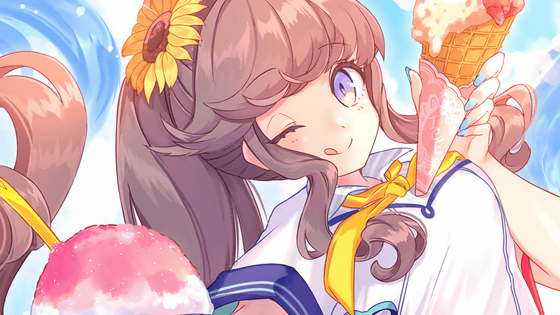
Left before correction, right after correction. You can move the middle slider to see the changes. Before correction, there is a lot of information, so it seems to be good for the layman's eyes, but as the original purpose of the illustration, it is prioritized that 'I have a glance at the appeal'. By putting the girl who is the main character in particular more clearly visible, I will push out the unity as a whole.
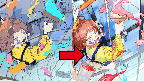
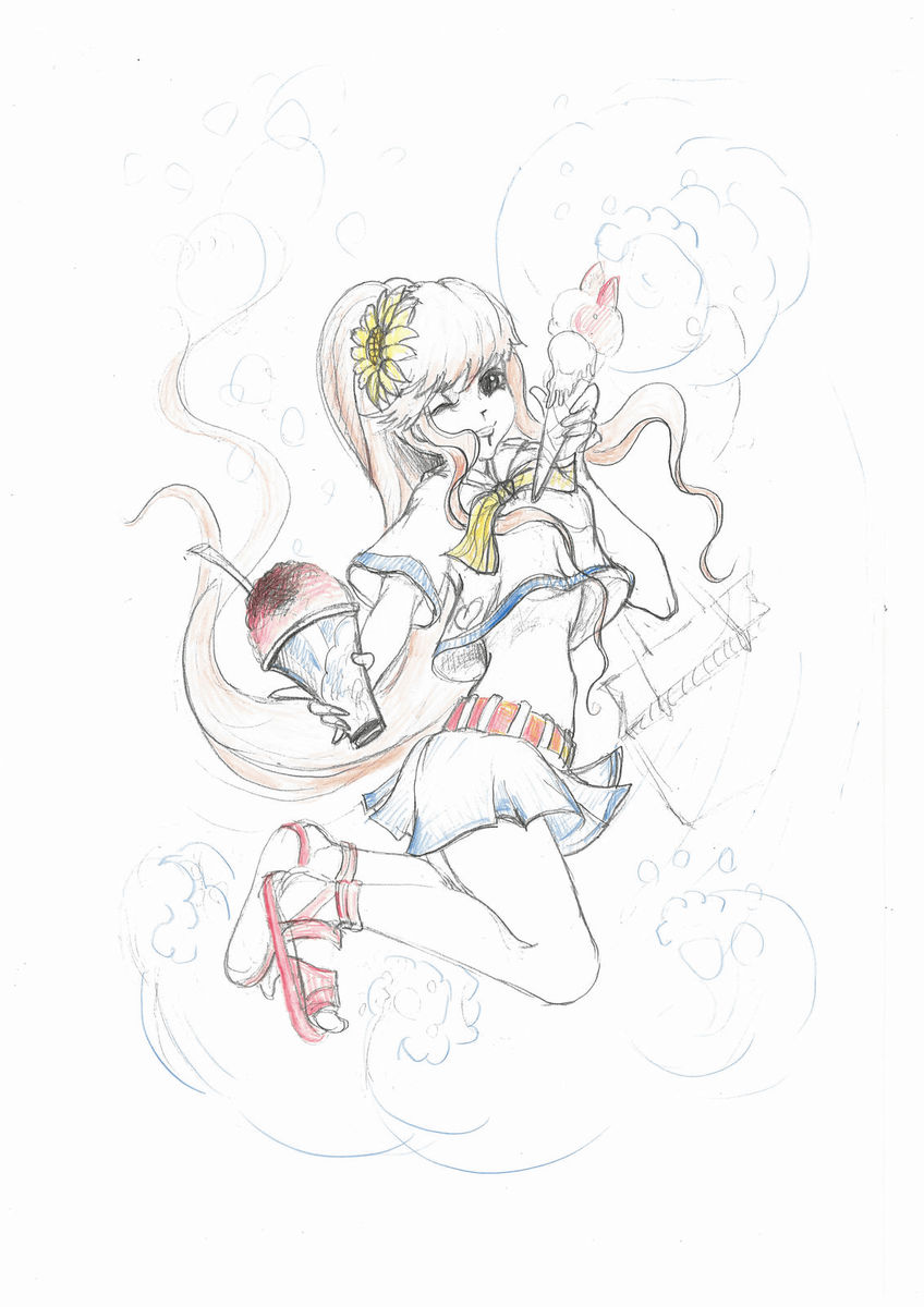
In addition to the background waves and sky expression being very excellent and well expressed from the beginning, it can be seen that the girl's attractiveness and reality are further improved after correction. Furthermore, we will also adjust further details, such as 'It is better if the movement of the hair can follow the waves and rise.' The following image is a sketch drawn by the checker in order to make the correction contents easy to understand.
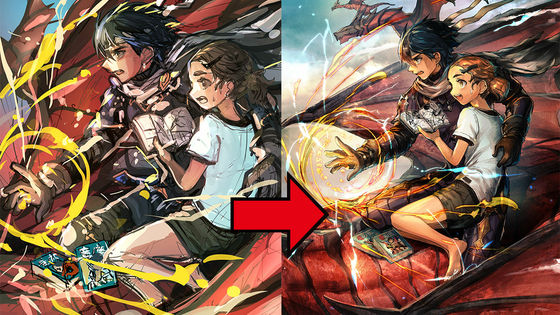
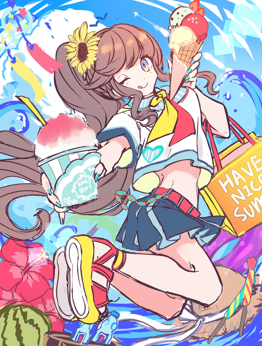
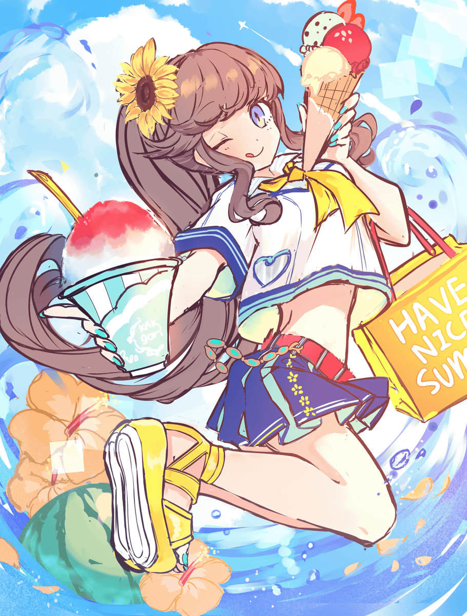
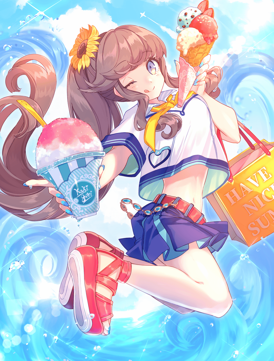
And the final rough. The part where there was a physical incongruity was also corrected, and the composition, expression, and color as an illustration became quite attractive, so the rough decision was made, and the rest was to be completed.
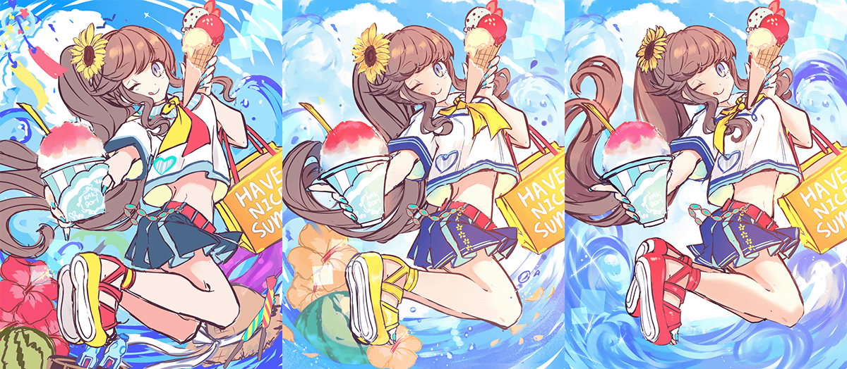
You can see how it changed by looking at the following.
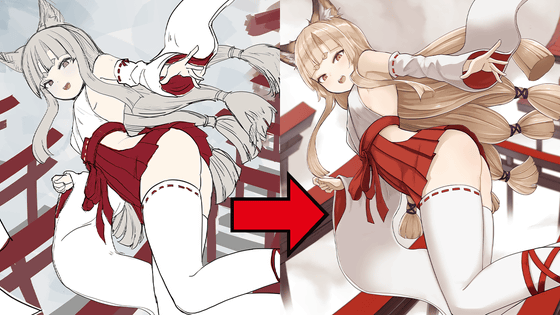
You can see the transition well if you order the rough from the left. At first, the swelling of the bust and the direction of the waist, etc., which had a sense of incongruity, have been completely eliminated, and the hair and feet have become natural movements due to minor changes. In addition, by adjusting the color saturation of the subject and the background, and by focusing on the background expression with a minimum of accessories, when you look at the package, it is easy to understand and you feel that it is a bright and attractive one It should be.
It has also been pointed out that 'It is very attractive that the wave expression is rough only in color and gives a three-dimensional effect, so it is better to slightly blur it than drawing in lines.' Only is drawn.
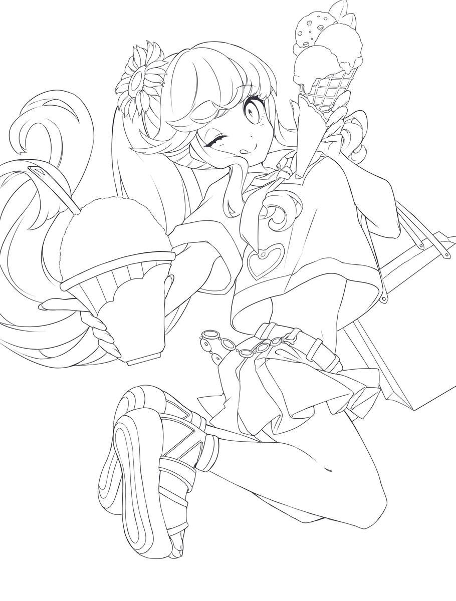
Color coding of characters.
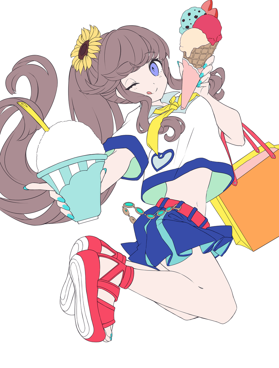
Then painting the details.
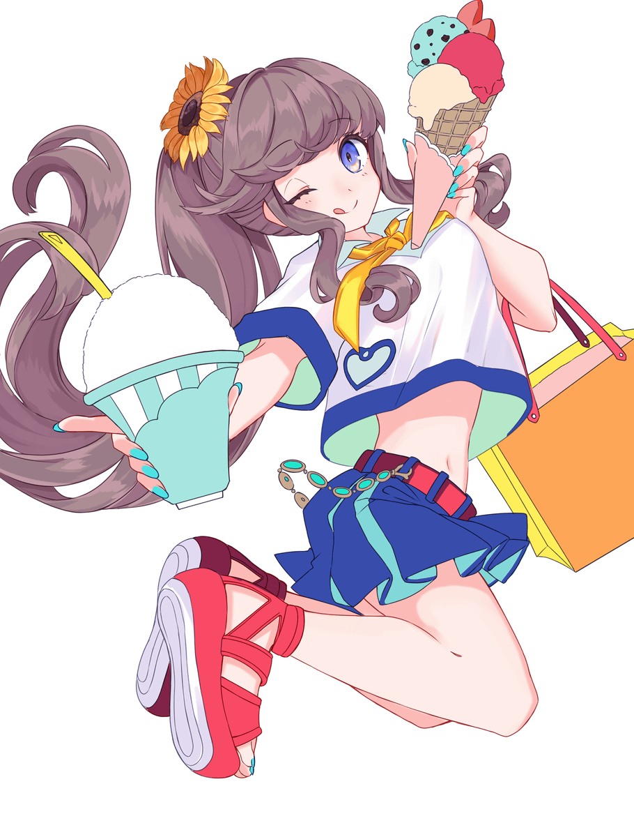
Add background and adjust border with person.
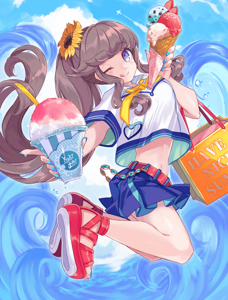
After fine adjustment, finally completed. The expression of the background and the girl's heartwarming also shines so brightly that it has become a very summer attractive illustration.
You can see the commented making from the author Machokko from the following article.
'GIGAZINE Manga Award' August 2019 Recruitment start & top picture making is like this-GIGAZINE
In addition to detailed illustration of illustrations, we will continue to publish secret materials such as manga production for members of the GIGAZINE Secret Club, so there are requests such as 'I want to see such information!' And 'I want to know such things!' Please come and see me later.
Related Posts: