Analyzing the surge in submissions to Show HN regarding 'unoriginal design patterns often seen in AI,' we find that a lack of originality is indeed the problem.
Entrepreneur and software engineer Adrian Krebs analyzed posts on the engineer community '
Show HN submissions tripled and now mostly share the same vibe-coded look
https://www.adriankrebs.ch/blog/design-slop/
Hacker News has a culture of showcasing your creations under the hashtag ' Show HN .' Dropbox and Stripe were among the first to be featured on Hacker News. In 2014 , formal guidelines were established, including rules such as 'Titles must begin with 'Show HN:'.'
Krebs said that while browsing Show HN posts, he felt that many projects had a somewhat impersonal and bland impression, as if they were generated by AI. Looking at the trend in the number of Show HN posts, it was found that the number of posts increased with the introduction of AI, and exploded in popularity within a few months of the launch of Claude Code.
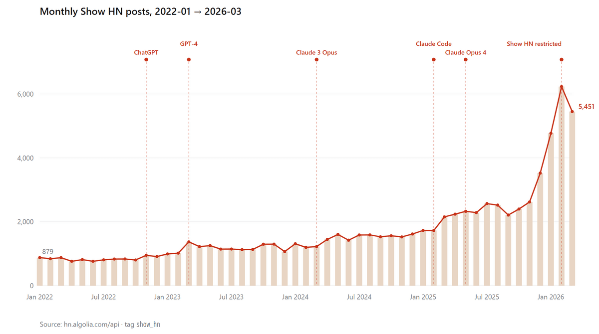
Krebs speculated that the increase in posts on Show HN was due to a large influx of posts 'generated with Claude Code,' and believed that by analyzing Show HN posts, he could identify common design patterns in AI and quantify the impression of 'what people perceive as AI-like.'
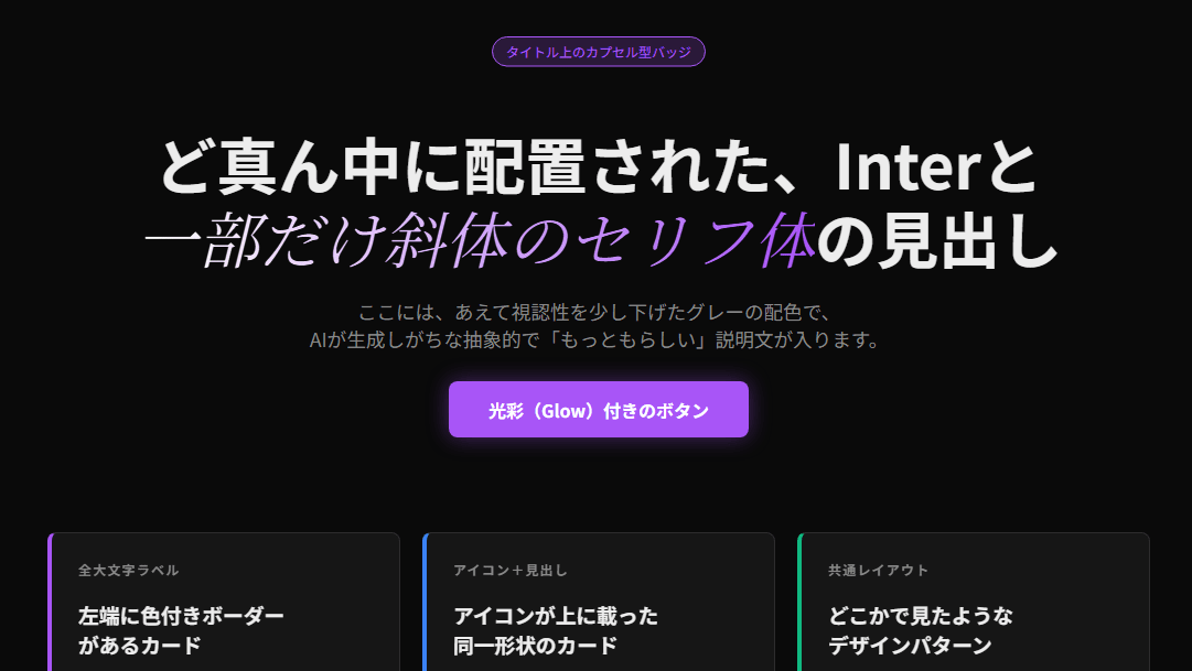
From Show HN's posts, here's what Krebs and his designer friends thought looked 'AI-like': The capsule-shaped badge placed above the title is particularly eye-catching.
Similar elements were used in another post.
Apparently, placing colored lines on the cards is also an AI-like technique.
Sometimes, colored lines are placed next to the cards.
Krebs says that displaying icons on top of the cards also gives it an AI-like feel.
The gradient background and glass-like cards also give it an AI-like feel.
Krebs identified 15 such 'AI-like elements' and analyzed how many of these elements were present in 500 posts by Show HN. The results are as follows.
- Extensive use of gradients
It was found that 28% of websites used gradients in their backgrounds or titles.
- Use shadcn/ui without making any changes from its default state.
shadcn/ui is a well-known UI component, and is known to
- Centered title
It's used on 23.5% of websites. AI seems to prefer the center.
- Always dark mode appearance
The set consists of a dark background with gray text, and all section labels in uppercase. It was used on 20.3% of websites.
- Templated feature grid
On 20.1% of websites, three or six identical cards with an icon at the top are placed below the title.
Glass form
Panels that blur the background and give the impression of floating were used on 17.1% of websites.
·font
AI reportedly uses a variety of fonts, including Space Grotesk, Instrument Serif, Geist, Syne, and Fraunces. 15.8% of websites use these fonts.
• Colored lines on the card
Add a colored accent stripe to the top or left edge of the card. This was observed on 13% of websites.
・Statistical banner
12.2% of the sites include banners such as 'Over 10,000 users · 99.9% uptime · 4.9 stars rating'.
The important button is purple.
Call-to-action (CTA) buttons, such as 'Register,' tend to use purple-based colors like indigo or violet. 10.7% of websites used purple-based colors for their CTA buttons.
• Headlines are all in capital letters.
10.5% of websites use all capital letters for section labels and navigation links.
• Numbered procedure sequence
On 9.4% of websites, tutorials that should have been displayed after the user decided to use the service appeared on the landing page.
- Capsule-shaped badge above the title
It appeared on 4.7% of websites.
• Vibrant box shadow
Buttons and cards will have a vibrant box shadow sheen. It was reportedly used on 4.3% of websites.
- Use emojis in the sidebar and navigation bar
Emoji icons appeared in the sidebar or navigation bar on 3.8% of the websites.
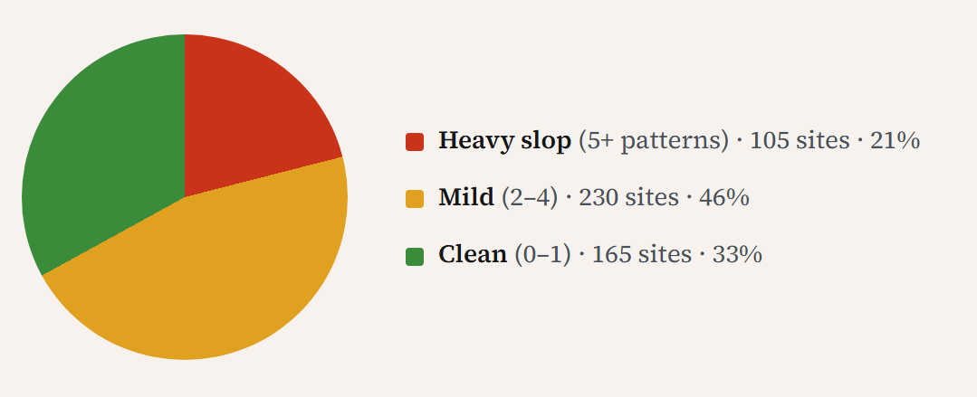
The presence of these patterns does not necessarily mean that the site was generated by AI. Therefore, Krebs classified the sites according to the number of patterns used. The results are shown in the figure below: 21% of the sites had 5 or more patterns, 46% had 2 to 4 patterns, and 33% had 1 or fewer patterns.
Krebs points out that 'before the age of AI, all websites looked like Bootstrap' and that 'design is irrelevant to validating business ideas,' adding that 'AI generation itself is not bad.'
However, he stated that 'the problem lies in using what AI outputs as is,' and that 'the same issue exists even when using templates in the pre-AI era,' highlighting the lack of originality regardless of AI.
Krebs concluded the article by saying, 'People will create beautiful designs again in order to stand out from the ordinary.'
Related Posts: