Google's 'G' icon now features a gradient design, which is being applied to Google search and app icons
Google updates G icon with brighter hues
https://blog.google/inside-google/company-announcements/gradient-g-logo-design/
Google's gradient 'G' icon, design is going company-wide
https://9to5google.com/2025/09/29/google-g-gradient-company-icon/
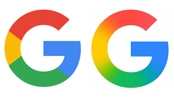
The Google icon used until now has been a 'G' mark made up of four colors: red, yellow, green, and blue.
This icon was announced in May 2025. It has been changed to a gradient design that gradually changes color from red to yellow, green, and blue. According to Google, this design will 'symbolize the growing AI-driven innovation and creativity across Google products and technologies.'
It has now been revealed that the new icons, which were only applied to certain services such as Google Apps as of May 2025, will now be common to the entire company.
The Google app looks like this.
![]()
The icon for Google search looks like this:
The profile picture for Google's X (formerly Twitter) account has also been changed to a new icon.
![]()
Google said it 'will continue this update to more products, platforms, and services over the coming months.'
Related Posts:
in Design, Posted by log1p_kr
