iOS 26 Liquid Glass Control Center is nearly unreadable, complaints flood in, latest beta quickly updates

Apple has announced a new software design called '
Apple heard your complaints about the Liquid Glass Control Center | The Verge
https://www.theverge.com/news/691540/apple-ios-26-liquid-glass-control-center-fixed-beta
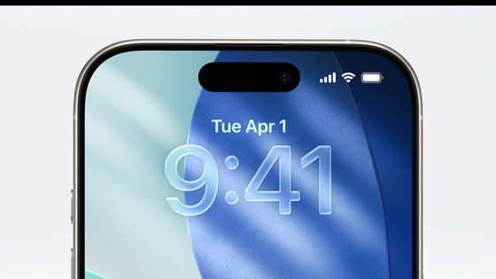
Apple announced a new software design called Liquid Glass at WWDC25 . The design reproduces the optical properties of glass, such as refraction and reflection of light, and the entire UI has evolved to be more rounded than ever before.
New iPhone and Mac design 'Liquid Glass' appears, reproducing the optical properties of glass such as refraction and reflection of light while the corners are rounded - GIGAZINE
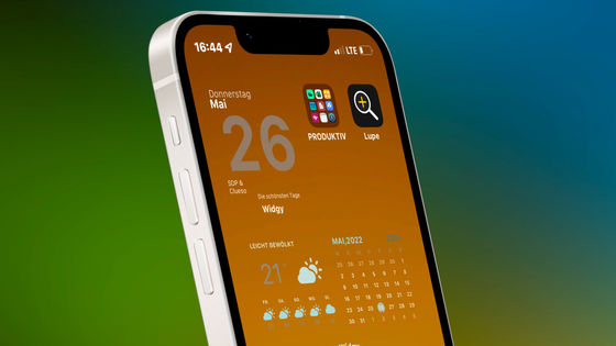
iOS 26, which uses Liquid Glass, is scheduled to be distributed around fall 2025, but beta 1 for developers is available early. However, users who used this developer beta 1 complained that the Control Center, which has an improved appearance with Liquid Glass, is difficult to see.
The problem is that Liquid Glass makes it difficult to distinguish between the background and the UI. In the image below, the control center is on the left and the UI for controlling the music playing is on the right. Both are difficult to see because the home screen behind them is visible through the screen.
It's kinda messy huh?🤔 pic.twitter.com/uhqAVM7avi
— Beta Profiles (@BetaProfiles) June 9, 2025
Depending on the background, it seems that the Control Center can be quite difficult to distinguish.
yeah i cant defend this pic.twitter.com/MmFQ4hMjba
— Holly - I like tech (@AnxiousHolly) June 10, 2025
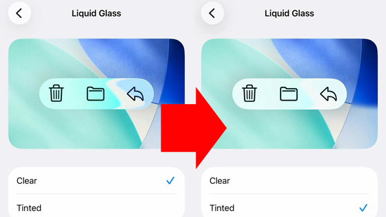
However, in the developer beta 2 released on June 23, 2025, the appearance of the Control Center was revised, making the background of the Control Center (home screen) much more opaque and making each icon easier to distinguish. The stronger background blur makes it easier to distinguish the icons in the Control Center.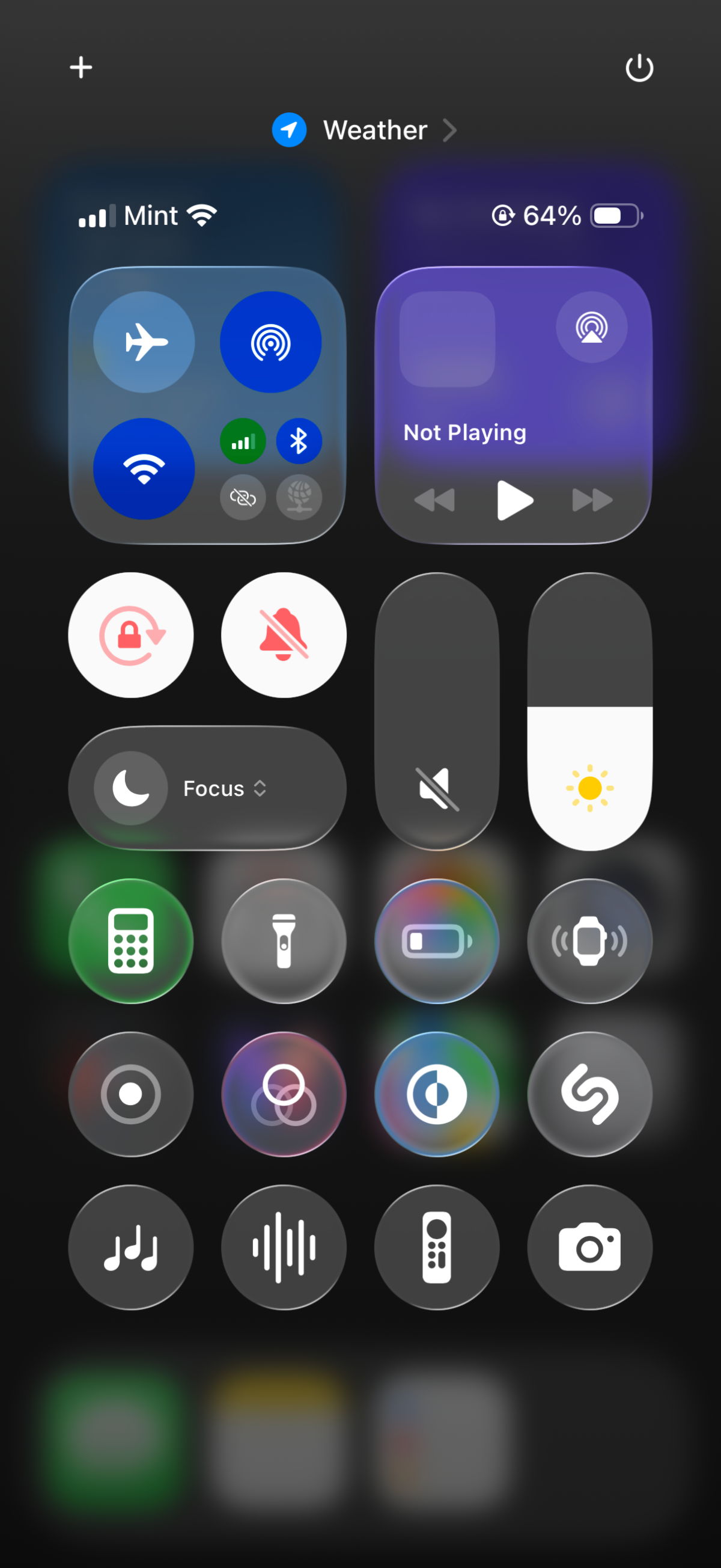
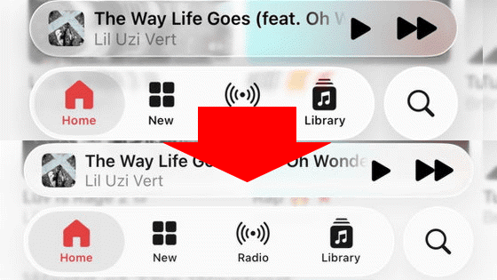
Regarding the new software design, Liquid Glass, some have pointed out that notifications are hard to read. This is also due in part to the weak background blur.
The contrast in iOS 26 is horrible. I do love the changes, but damn this is hard on the eyes! #iOS26 pic.twitter.com/WUZmP6kMUV
— Patrick Celaya (@CelayaVentures) June 9, 2025
this just seems harder to read? #ios26 pic.twitter.com/GJeHgYUHKJ
— Stammy (@Stammy) June 9, 2025
This is especially noticeable when the iPhone wallpaper is a light or pale color.
I can't see anything 😅 pic.twitter.com/qqBtaibQis
— Beto (@betomoedano) June 9, 2025
Related Posts:

in Software, Smartphone, Design, Posted by logu_ii