Do universally designed digital textbooks designed for children with visual and reading disabilities improve reading comprehension and reading aloud?

The Japanese font '
The effects of universally designed digital textbooks on reading accuracy, fluency, and comprehension in children with developmental dyslexia
https://www.jstage.jst.go.jp/article/jjlp/64/2/64_105/_article/-char/ja/
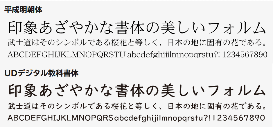
The UD Digital Textbook Font, released in 2016, was designed to be easy to read for children with low vision or dyslexia, and to make the movements and shapes of the characters easy to understand when writing by hand.
The UD Digital Textbook Font is designed to match the character shapes of existing textbook fonts, maintaining the shape of the brush strokes to make it easy to understand the stroke order and direction, while reducing the thickness of the lines.It also incorporates various innovations, such as eliminating the decorative strokes seen in other fonts, making the voiced and semi-voiced consonants larger, and widening the spaces between the lines to make it easier to distinguish between characters.
The top is the Mincho font used in junior high school textbooks and the common university entrance exam, and the bottom is the UD Digital Textbook font. Comparing them, you can see that the UD Digital Textbook font has consistent line thickness as much as possible and has eliminated brushstrokes, stops, and small decorations.
A paper titled 'The effects of universal design digital textbooks on reading aloud accuracy, fluency, and comprehension in children with developmental dyslexia,' published in the 2023 journal of Speech-Language Medicine, reported the results of a study into the effects of UD digital textbooks on reading aloud and comprehension in 24 children with developmental dyslexia and 24 children with typical development, ranging from fourth grade of elementary school to third grade of junior high school.
In the experiment, the children were given reading aloud tasks and reading comprehension tasks created using two types of fonts: UD digital textbook font and standard textbook font, and the children were analyzed for how accurately they were able to read aloud and answer questions. A questionnaire was also conducted to find out how easy the children felt the text was to read.
The results of the experiment showed no significant differences between the two fonts in terms of the time required for the reading aloud task, the number of misreadings, the number of mistakes that children realized they had made, or the number of correct answers in the reading comprehension task. In other words, no objective difference was found in the rate of correct answers between the UD digital textbook font and the regular textbook font for children who have difficulty reading and writing.
On the other hand, in a survey about the readability of the characters, both children with and without reading and writing difficulties answered that 'UD Digital Textbook Font is easier to read correctly.' This suggests that subjectively, UD Digital Textbook Font is more likely to be preferred.

The results of this research have also become a hot topic on Hatena Bookmark, with one user who has a child with dyslexia saying that although the UD digital textbook font is used on handouts distributed at school, no significant difference has been observed, and that 'the size of the type is more important than the font.'
[B! Design] The effects of universally designed digital textbooks on reading accuracy, fluency, and comprehension in children with developmental dyslexia
https://b.hatena.ne.jp/entry/s/www.jstage.jst.go.jp/article/jjlp/64/2/64_105/_article/-char/ja/
Related Posts: